Cross-Browser CSS Compatibility Cheat Sheet
The 25 CSS issues that come up most in ecommerce themes across Chromium, Firefox and Safari, each with the fix.
Free. No email required. Use your browser’s print dialog and choose “Save as PDF”.
Cross-Browser CSS Compatibility
The 25 most common CSS issues in ecommerce themes across Chromium, Firefox, and Safari — with the fix for each. Pin this to your monitor.
Flexbox Issues
gap in flexbox wasn't supported until Safari 14.1. Older devices show elements crammed together.
.flex-container > * + * { margin-left: 16px; } with @supports (gap: 1px) { ... }flex-basis: 33.33% with padding causes overflow because box-sizing isn't consistently applied to flex-basis.
box-sizing: border-box globally. Or use width instead of flex-basis for percentage columns.min-height on a flex column container doesn't work with align-items: center for vertical centering in older Safari.
height instead of min-height, or add an inner wrapper with display: flex; align-items: center;align-content: space-between on a wrapping flex container distributes differently with only one row.
align-content: flex-start and apply space-between only when multiple rows are expected.CSS Grid Issues
Complex grids mixing explicit/implicit tracks with grid-auto-flow: dense place items differently across engines.
dense for critical layouts. Use explicit placement (grid-column, grid-row) for important elements.grid-template-columns: subgrid only recently gained support across all engines.
@supports (grid-template-columns: subgrid) { ... } with a non-subgrid fallback.Percentage heights inside grid items resolve differently in Safari when the container has no explicit height.
min-height or use fr units instead of percentages.Visual Effects & Filters
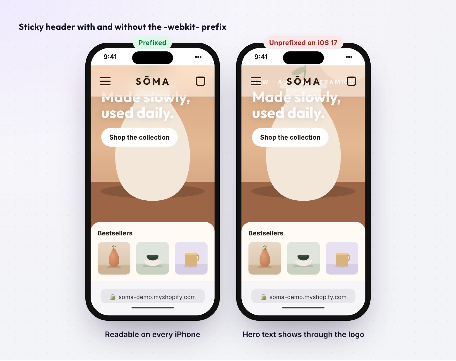
backdrop-filter: blur() needs the prefix. Without it, frosted-glass headers/modals are fully transparent.
-webkit-backdrop-filter: blur(12px); backdrop-filter: blur(12px);mix-blend-mode creates a new stacking context in Safari but not always in Chrome.
isolation: isolate on the parent container for consistent stacking.filter: blur() on images shows pixelated edges in Firefox.
overflow: hidden and scale image to 102% to hide edge artifacts.clip-path: polygon() shows jagged edges in Safari.
Scroll & Position
position: sticky breaks when any ancestor has overflow: hidden/auto/scroll. Extremely common in Shopify themes.
overflow from all ancestors of the sticky element. Restructure DOM if overflow is needed for other purposes.Safari's smooth scrolling feels "stickier" and slower than Chrome's implementation.
overscroll-behavior: contain wasn't supported in older Safari. Scroll chaining in modals leaks to the body.
position: fixed on body when modal is open. Or use touch-action: none on the overlay backdrop.100vh includes address bar height on iOS, cutting off hero sections.
height: 100vh; height: 100dvh; (dynamic viewport) or -webkit-fill-available.Typography
Same font-weight: 600 appears thicker in Safari due to different anti-aliasing.
-webkit-font-smoothing: antialiased; -moz-osx-font-smoothing: grayscale;Custom variable font axes may not render in Firefox if font-variation-settings syntax is wrong.
font-weight, font-stretch) when possible. Reserve font-variation-settings for custom axes only.text-decoration-thickness and text-underline-offset aren't supported in older Safari.
border-bottom for critical decorative underlines as a cross-browser fallback.Media & Images
Safari requires muted AND playsinline for autoplay. Without both, hero videos show blank.
<video autoplay muted playsinline loop> — always include all attributes. Add poster image as fallback.object-fit: cover behaves unexpectedly when image has no explicit width/height attributes.
width/height attributes on <img> tags, then override with CSS.aspect-ratio wasn't supported until Safari 15. Product cards relying on it collapse.
.box { position: relative; padding-bottom: 100%; } with @supports (aspect-ratio: 1) { ... }Forms & Inputs
Safari applies heavy native styling to selects, date inputs, and buttons that overrides CSS.
-webkit-appearance: none; appearance: none; then style from scratch.:focus-visible triggers differently — Safari shows focus rings more conservatively.
:focus and :focus-visible. Use :focus:not(:focus-visible) to suppress mouse-click rings.iOS auto-zooms when focusing inputs with font-size < 16px. Causes layout shift.
font-size: 16px minimum on all input, select, and textarea elements.Chrome uses ::-webkit-scrollbar. Firefox uses scrollbar-width and scrollbar-color.
scrollbar-width: thin; scrollbar-color: #888 transparent; AND ::-webkit-scrollbar { width: 6px; }Where ThemeSync fits
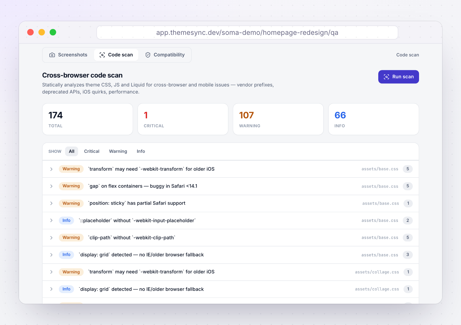
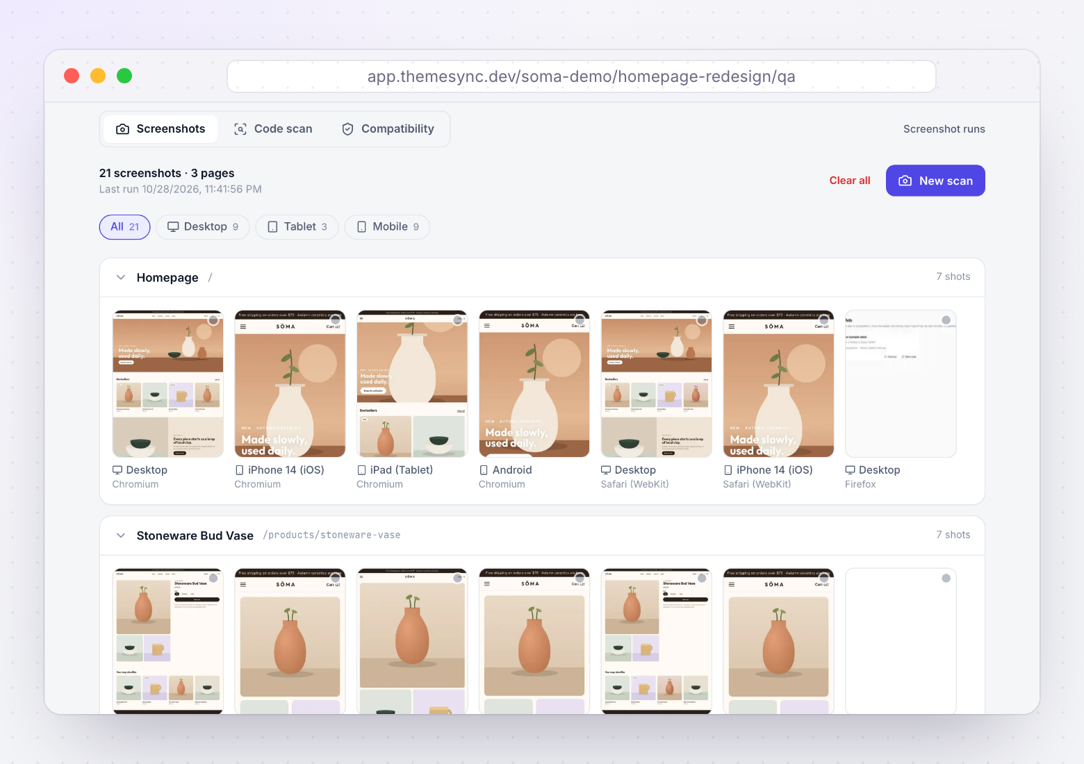
The cheat sheet gives you the fix. ThemeSync helps with the two steps around it: finding where an issue is in the theme, and checking the fix in each browser. Screens are from a demo store.
More free resources
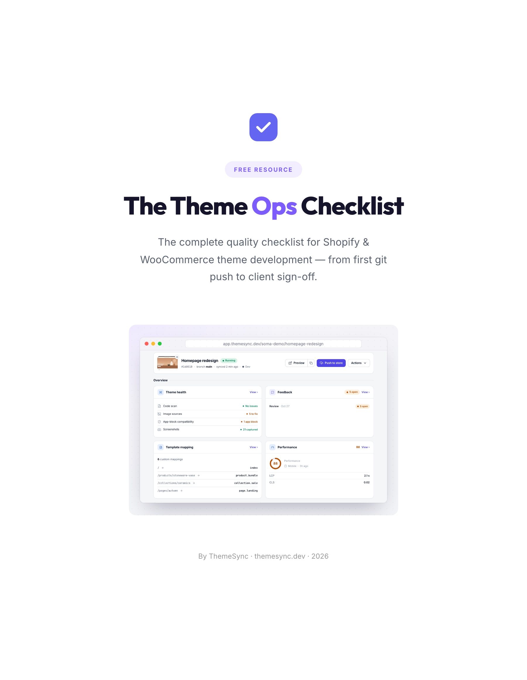 ChecklistThe Theme Ops ChecklistThe 86-point quality checklist for Shopify and WooCommerce theme projects, from the first git push to client sign-off. Print it or save it as a PDF.
 TemplatesClient Review Email Templates10 copy-paste emails for every stage of a theme review, from the preview handoff to final sign-off, including reminders and scope replies.
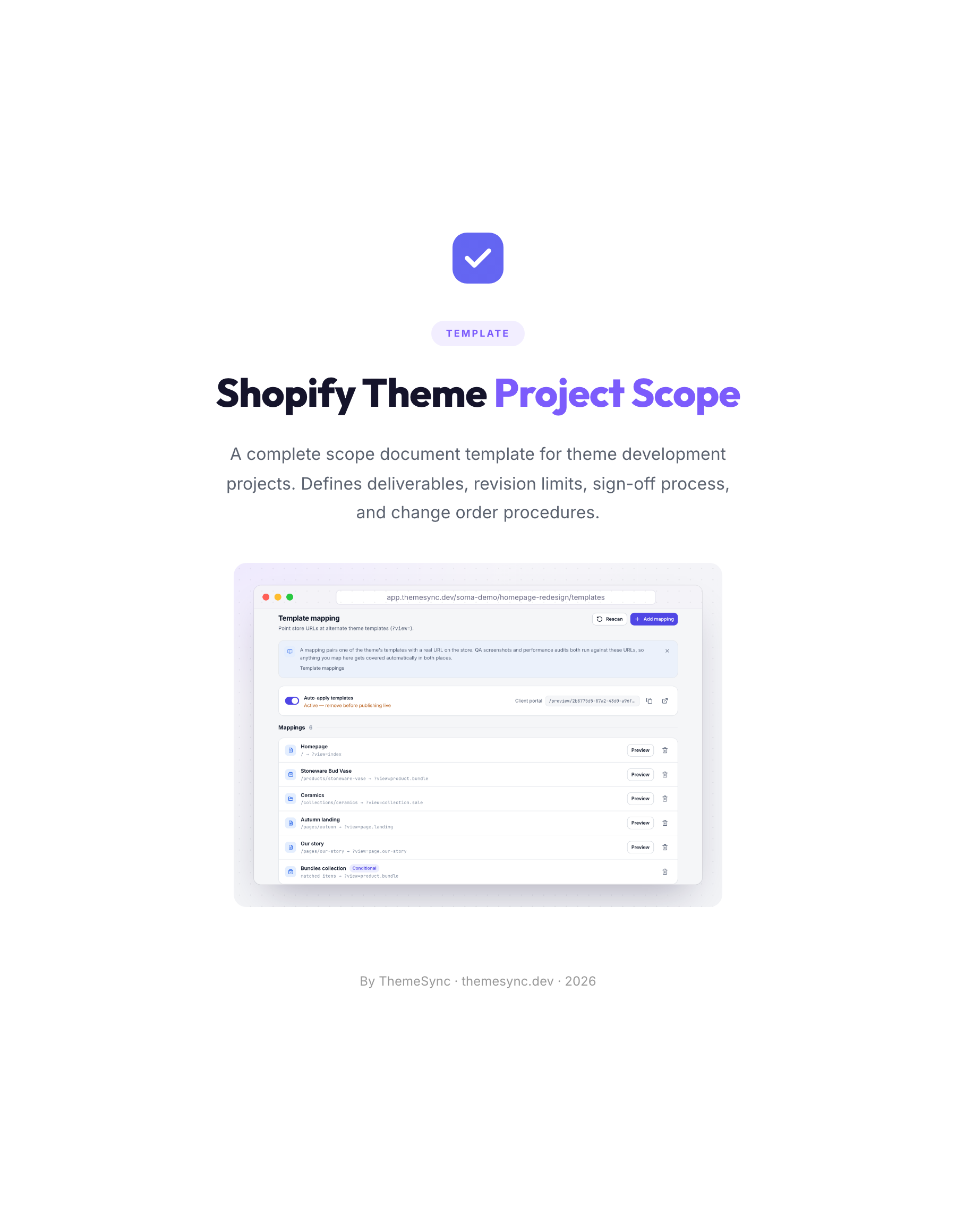 TemplateShopify Theme Project Scope TemplateA scope document for theme projects: deliverables, templates in scope, revision limits, the sign-off process and change orders.